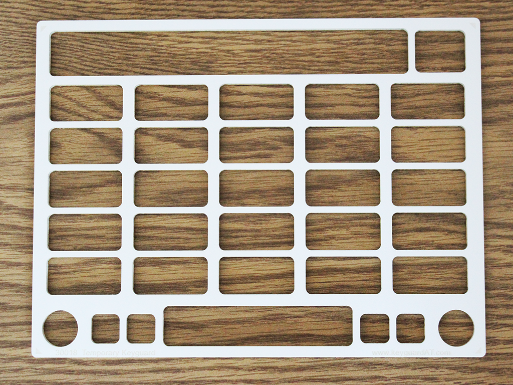
This temporary keyguard allows you to test the suitability of a keyguard for a GoTalk Now user. The keyguard uses the same design files as our regular keyguards, so you know it will fit the layout of the screen perfectly.
Temporary keyguards are laser cut from 1/8" foam board, the same thickness as our standard keyguards, so you can see how the end user will deal with the size and depth of the openings. The keyguards do not fit any particular case, and they're not intended as a permanent solution, so they don't come with any attachment method. You attach them with a temporary means like tape or Blu-Tack. Suction tape is an excellent, more reliable attachment.
There are two styles from which to choose:
- Visible screen - The keyguard is slightly bigger than the visible portion of the screen. It will fit loosely in 90% of iPad cases just the way it is. If your case has a very small screen opening, like a GoNow or AMDI case, you can easily shave a hair off the edge with a razor knife to fit it.
- Full iPad - Select this style if you can test the iPad out of the case. The keyguard will be made to cover the iPad screen. This makes it stronger and gives you much more room for mounting to the iPad.
Note: Be aware that Attainment occasionally changes the layout of the GoTalk Now screen. Keyguards made to fit the current version may not fit future versions of GoTalk Now, and thus are not covered by our keyguard warrantees. Our warrantees cover design and breakage, but not changes made by Attainment.
App Settings and Options
This keyguard supports different designs based on user settings and preferences. Each of these affects the positioning of items on the screen, and thus the design of the keyguard itself. Your temporary keyguard will be truly custom-designed to match every one of the choices you make for the end user.
GoTalk Now Version - Keyguards are not backward-compatible with older versions of GoTalk Now. Your GoTalk Now must be at least as new as the version listed.
Number of Buttons - This is the number of buttons you have chosen in the Page Options screen of the Page Editor.
Express Page/Message Bar - Also in the Page Editor's Page Options. If Express page is On, the message window will be exposed to show what the user is typing. When off, the message window goes away and the buttons get bigger. In the Express Page Settings section of the Settings screen, you can also set whether the message bar (here called the Express Bar) appears at the top or the bottom of an express page.
Previous and Next Page Buttons - These are the round buttons in the lower left and right corners that allow navigation between pages. They can be on or off in the Player. They are on by default, but you can choose to turn them off in the Buttons section of the Settings screen.
Home/Back Buttons - This is the pair of square buttons on the lower left. In the Player they are the Home and Back buttons, and in the Page Editor they are the Home Screen and Page Options buttons. They can be on or off in the Player. They are on by default, but you can choose to turn them off in the Buttons section of the Settings screen.
Jump/Vocab Buttons - This is the pair of square buttons on the lower right. In the Player they are the Jump To and Core Vocabulary buttons, and in the Page Editor they are the Pages and Templates and Add Core Vocabulary buttons. They can be on or off in the Player. They are on by default, but you can choose to turn them off in the Buttons section of the Settings screen.
Page Label - This is the area at the bottom center of the screen that contains the page icon and title. It can be on or off in the Player. It is on by default, but you can choose to turn it off in the Buttons section of the Settings screen.
Cell Openings - The default cell openings are rectangles with rounded corners, the same size as the cells. Elliptical openings are the same size as the cells. If you choose square or circular openings, they will be centered in the cells, reduced to fit in the cell. The extra space helps the user differentiate between the cells, and allows a little place for fingers to rest. If you choose anything other than full-sized rectangles, do not choose a colored material, as some information in the cells will be covered by the keyguard.
Reduce Openings To - If you specify a maximum opening size, the dimensions of the grid cells will be reduced so they are no bigger than the maximum you specified. If the cells would naturally be 1" wide and ".5" high, and you specified a maximum of 0.75", the cells would be reduced to 0.75" x 0.5". Round or square openings are reduced in both dimensions to the specified size. If the cells are already smaller than the specified size, nothing will change.
Swipe to Home - Newer iPads don't have a home button for returning to the home screen, so they require the user to swipe up from the bottom edge of the screen to return to home. If the user doesn't need access to the home screen, or if you're using a virtual home button, you can leave this closed for a much stronger and more esthetic keyguard. If the user will need to swipe to return to the home screen, you can open this, but note that this leaves an ugly notch in the bottom edge of the keyguard. The keyguard will be much weaker, and it may allow access to items on the bottom of the screen that would otherwise be unaccessible.
Special Instructions - Use this field to communicate any other information we need to know about the keyguard.